In 2013, Lemberg leadership took a hard look at the way the company was represented to the public and decided it needed a face lift. After all, Lemberg was growing. The company had acquired a few businesses and expanded services. The team embarked on a rebranding process that would take more than a year to complete.
Enter design and marketing firms, writers, and social gurus who advised on every aspect of the external representation of the company. In the end, Lemberg's branding/marketing committee changed not only the logo, but also the look of printed materials, website and even the way they "spoke" to the customers through these media.
The company colors went from grey with a deep burgundy to grey with bright orange. The existing logo, a passive egg shape now affectionately known as the "runny egg", was replaced by a stronger, sharper logo designed by in-house Art Director for the Sign Division Eric Bailey that sported a bright orange lightening bolt and bold, upright lettering that simply says, "Lemberg" as opposed to "Lemberg Electric Company, Inc." Though the company flagship remains the electrical construction division, the cleaner, leaner logo leaves room for diversified services that include electrical service, data communication, energy technologies and business signs.
The website was also redesigned to include all areas of service and conveniences like a blog and online forms. The new design represented the divisions in bold imagery and gave users clear choices for reviewing services, learning more, and contacting the company. The new site launched in fall of 2014.
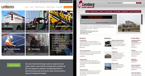
Lemberg website 2016 vs. 2014.
A new print piece followed suit. In early 2016 a new piece was developed to introduce all divisions with colorful imagery, bold headlines and text that speaks to potential customers with a new confidence. Shown in the image below, the look and feel are quite a departure from the previous branded paneled brochure. Instead of the typical format, Lemberg took a booklet approach.
 Lemberg brochure today and yesterday.
Service trucks and field staff were outfitted to match the new brand. Field technicians now sport bright orange branded clothing on the job. The Lemberg orange was carried through the building décor. Trucks and business cards display logos with iconography that represents its service areas.
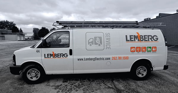 Lemberg service truck, 2018.
This year marks Lemberg's 90th in business and 25th year of employee-ownership. To commemorate these milestones, the website was again updated -- this time temporarily -- to reflect the anniversary. The website imagery became more human-centric with a sepia nod toward history. Special pages were created to help tell the history of the company, including an updated history page, culture gallery, a new corporate video, and even an area for customers and friends to pass along a "congrats" message.
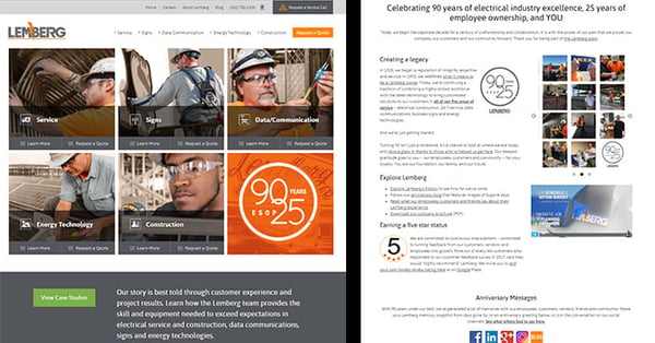 Lemberg website, 90th Anniversary year.
It's interesting to know that where we are today will one day be part of a distant history. Regardless of how the Lemberg brand appears in the future, the Lemberg orange is a strong reminder of who we are today.