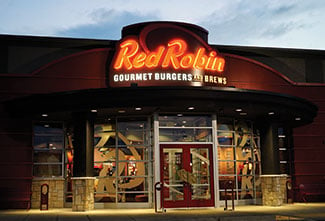
Many people are of the mindset that signs are “just signs.” After all, what does a sign have to accomplish other than say who you are as a company? Let’s consider that for a minute: a sign tells WHO YOU ARE. Just as your daily wardrobe is a reflection of who you are personally, your business sign is a reflection of your brand. And that, as any marketer will tell you, is when a sign becomes more than “just a sign.”
Signs offer the opportunity for your company to tell part of the brand story, direct customers to a location and even prompt action. From location to materials, a lot can — and should — go into the making of your business signage. If done right, your signage will be a combination of design, marketing, physics and psychology.
First Impressions
Brand signage presents a first impression with a potential customer. It can speak volumes! The colors, composition, design, construction, location and condition of your signage will tell your customers and potential customers not only how you feel about attracting their business but also how you feel about your own business.
As a potential customer, how would you view a damaged sign? Would it indicate a lack of care? Or, consider poorly placed or non-existent directional signage. Isn’t it nice when a company takes the time to assist you in finding your way? Signage speaks to your INTENT as a business.
Know your audience
 It’s important to begin planning for your sign by studying your audience. How will they view your sign and from where? What message do you want them to receive by viewing your sign? Will a static sign suffice or will your audience benefit from the ever-changing text of an electronic message center? Is your sign in a well-lit area or does it need its own lighting?
Pieces of art
Business signage can be engineered pieces of art designed to attract an audience. Nothing says quality more than a sign designed for specific architecture, positioning and landscape. Designers know that placement of brand signage affects the design and structure of the sign. Whether you plan to design your sign around your logo or incorporate art into your sign, your customers will appreciate your attention to detail.
Psychology of the Sign Color
 There is a psychology behind signage. Designers are smart to consider this psychology when advising clients. We know that we can manipulate the decision making of an audience by adjusting colors alone. According to Color Psychology (colorpsychology.org), colors within the blue/green/purple area of the spectrum, instill serenity, while colors within the red/orange/yellow area create more passionate, energetic action. Artists, decorators, designers and marketers are all aware of how color affects the brain and they use that knowledge in their professions. It’s why McDonald’s brand colors are yellow and red, why hotel rooms are decorated in muted shades and why online action buttons are red or orange.
Here are some general guidelines on color as a marketing tool from Act On (act-on.com):
- Blue: a calming, confidence color used by companies that want to depict dependability such as financial and technical companies.
- Red: a power color that gives a sense of urgency used by restaurants and other B2C companies that need customers to take an immediate action – buy now!
- Yellow: an optimistic and friendly color used by brands that want to engage customers.
- Green: another calming color that depicts growth used by companies that want to show a consciousness, peace and awareness.
- Orange: a carefree color that can also indicate caution. Brands that want to send this dual message, like Harley Davidson, can successfully use orange. Oftentimes, the color may be combined with other, more serious colors like blue or gray to ground the brand.
- Purple: the color of royalty and creativity used by brands that want to portray a feeling of quality.
- Black: conveys power and authority. Shades of gray may work to convey the same with a modern, less oppressive feel.
- White: conveys clarity and openness and is used to stand out and contrast with other colors.
Depth, Dimension, Shape – Oh My!
Depth, dimension, and shape play roles in your audience’s perception of your signage. Logos and copy that look great on paper don’t always translate well to 3D fabrication. Signs can be constructed of many different materials such as metals, plastic, and even fabric. Elements like lighting, shape, size and location will all affect the final cost of production and installation. It is always good to be aware of these and to connect your audience expectation and your intent accordingly.
 To Light or Not to Light
That IS a question you need to answer. Consider the location of your sign and whether your audience would appreciate a lit, non-lit or indirectly lit sign. What might work best for your brand and the location of the sign? Consider maintenance as well. Signs in hard to reach areas might be best served with long-lasting and efficient LED lights or indirectly lit with easy-to-reach fixtures.
There are so many facets to sign design, construction and installation. It is wise to consider these when initially creating your brand. We recommend working with our sign professionals to be sure your sign represents your brand well to your desired audience.
*images from Lemberg's client files. Please feel free to frequent these great establishments!
Got a question or comment about signage? Feel free to use the comments section below!